FoodRacoon
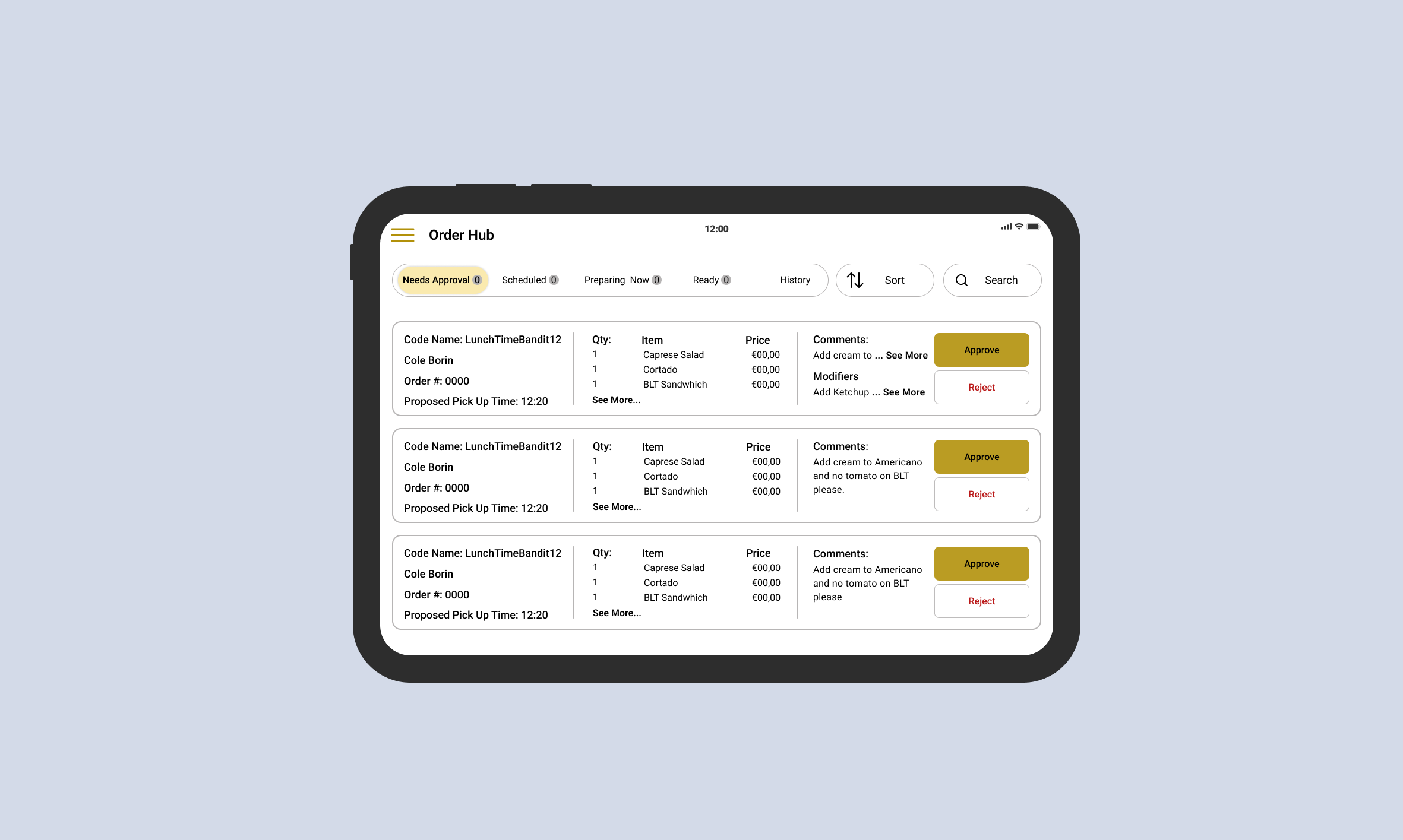
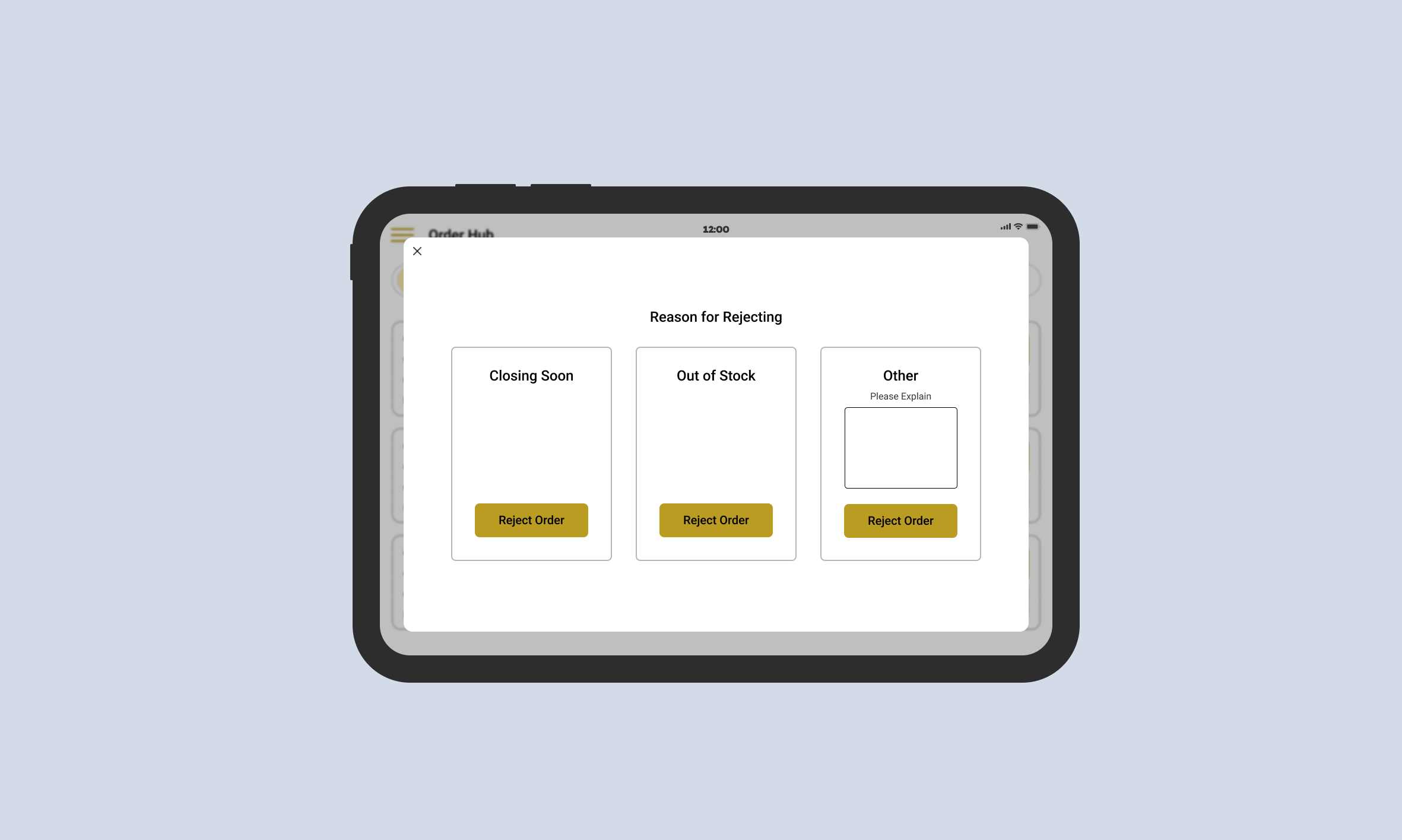
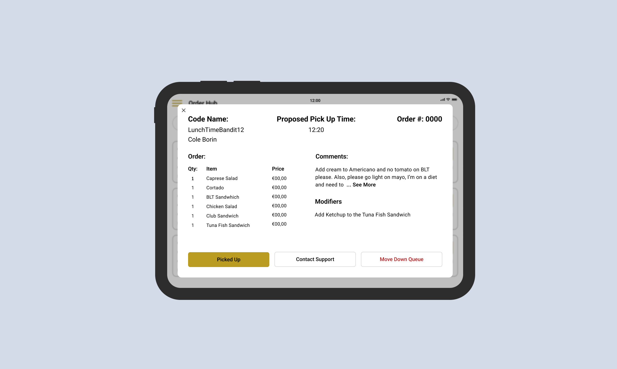
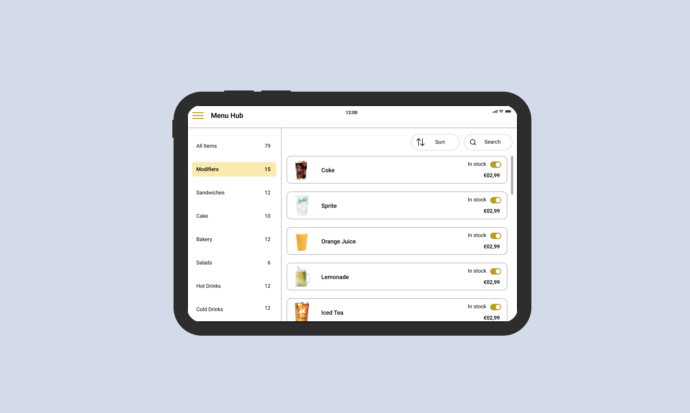
With FoodRacoon, restaurants can effortlessly manage orders. The intuitive interface allows users to view and accept or decline incoming orders based on availability. Basic menu editing features make it easy to adapt to changes. Meanwhile, customers stay informed through timely notifications about their order status, empowering them to plan their lunch breaks effectively.
Overview
The Challenge
FoodRacoon was a part of a school internship program with Springboard. They had just finished creating a B2C prototype of a food ordering app when we were assigned to each other. They were looking for us to create an MVP app that would allow restaurants to manage orders that would be placed on the B2C app.
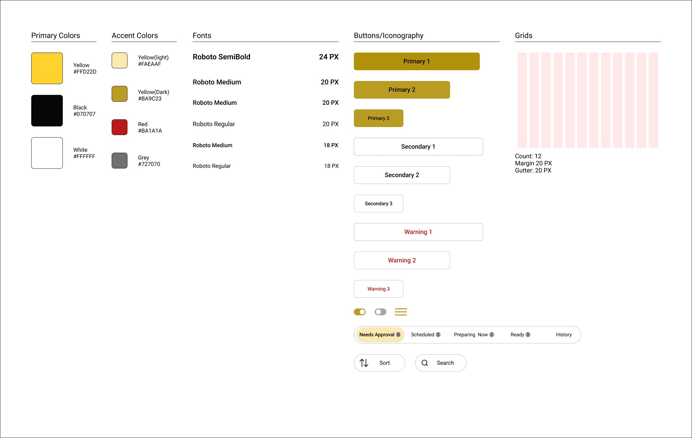
Our Team found it helpful to use the B2C app as a reference, but overwhelming due to the limited number of components that could carry over. Therefore, we had to create a rudimentary design system based on the previous work.
The Solution
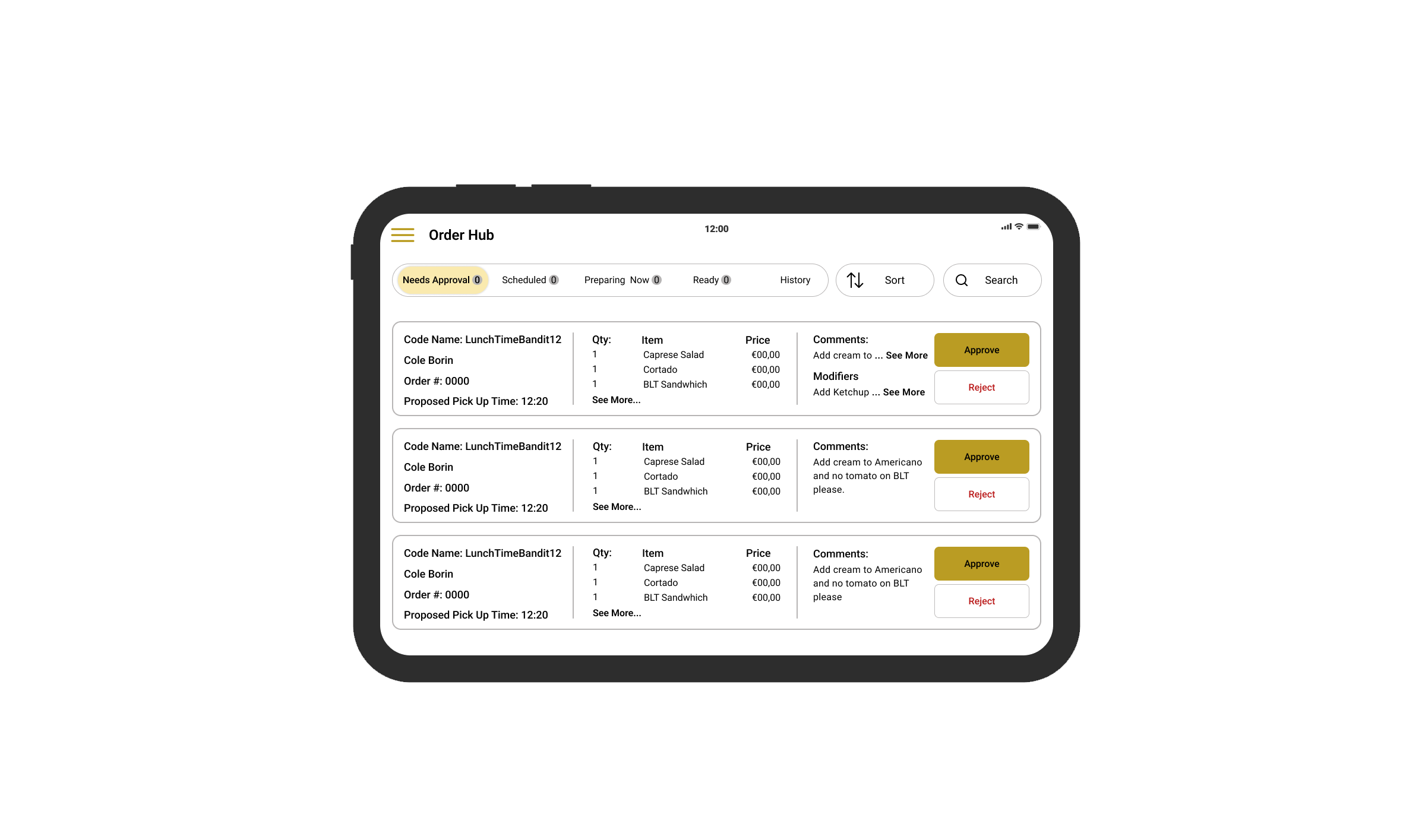
We presented FoodRacoon with a working prototype of a B2B tablet app that aligns with their existing B2C mobile app. The UX team and I used components from the already existing app but implemented improvements to aid in future development.
Process
Understand | Research | Sketch/Wireframe | Design/Prototype | Test | Refine
My Role
Ux Designer on a team of 2 other designers
Managed team meetings and team logistics
Tools
Figma
Miro
Duration
4 Weeks
Understanding
First Meeting and Project Details
Our project started with a meeting between the CEOs of Food Raccoon and our UX design team. During this session, we delved into a comprehensive understanding of the product, discussed design expectations, and strategized the most effective course of action moving forward. After careful consideration, we unanimously agreed upon a slightly customized agile approach, as it offered the best means to accomplish the project within the designated time frame, while also permitting ongoing development opportunities for the company.
Questions for FoodRacoon
How do we make order management as easy as possible?
Research
Primary Research
Interviews with restaurant workers played a pivotal role in understanding their preferences and pain points when using delivery apps. Their feedback yielded the need for clear visibility of order statuses, efficient access to order details, and intuitive navigation that doesn’t impede their workflow.
Secondary Research
We conducted a thorough analysis of competitors in the market, seeking inspiration and identifying elements that aligned with the original vision discussed with stakeholders. Additionally, I did not have experience in creating B2B apps before. This meant we had to utilize the elements taken from competitor analysis and mesh them with what we had learned through our primary research.
Sketch/Wireframe
Wireframes
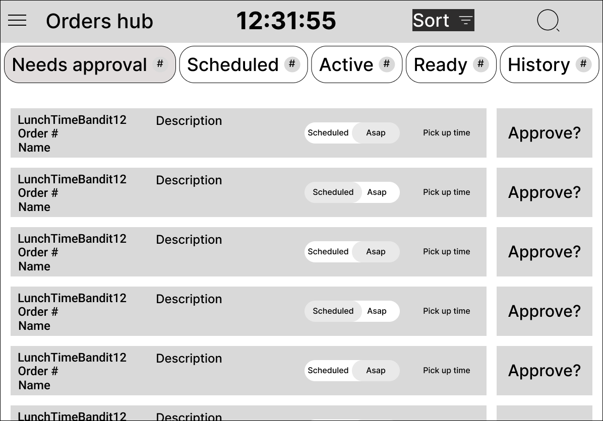
Based on our meeting with the CEOs and our research, we began to create wireframes. Our team decided to divide and conquer, so I designed the basic layout of our order hub, a teammate designed the pop-ups, and another designed the menu hub.
Columns VS. Tabs
When we originally discussed the FoodRacoon app, the FoodRacoon CEOs wanted to design the app using columns to sort the status of the order. However, the design team quickly realized that there were too many statuses to effectively view where the order is. Our solution was to use tabs, rather than columns. The FoodRacoon stakeholders agreed with the solution and it made its way into the high-fidelity version.
Design/Prototype
Rudimentary Design System
In parallel with creating our wireframes, we began creating a rudimentary design system to fit this project and to aid in further development for the company.
High Fidelity
We went through several redesigns of specific elements in the high-fidelity version, due to a communication breakdown between the UX team and FoodRacoon. To resolve this, we held a town hall meeting where we clarified confusion, answered questions, and encouraged open dialogue. This meeting helped align perspectives and establish a unified project direction.
Prototype
A prototype was made for the client to easily view the design and to see how the app would work. Additionally, this aided in user testing sessions and allowed testing participants to complete tasks we would give them.
Testing
User Testing Methodology
Testing sessions were conducted through Zoom
We tested 5 participants 2 restaurant workers and 3 people who do not work in restaurants
Users were given a set of tasks to complete
Progress through the tasks was closely monitored
Following the completion of the tasks, a series of questions were asked to gauge the understanding of the purpose of the functionality
A separate set of questions were asked to gauge the overall opinion on the look and feel of the prototype
Results
Throughout all of our testing, users were able to complete the tasks that were given to them and understand the use of each element. However, there was a strong cognitive load when users were trying to understand the exact wording of specific elements, like the “Active” tab or “Move Down Queue”.
Refine
Our Thoughts Shared with FoodRacoon, Changes, and Future Design Work
We sat down and discussed our findings with the FoodRacoon team. Overall, it seemed that there were not many major changes that needed to be made. However, it was decided that we would adjust some of the wording and leave others as is. The stakeholders shared with us that there would be some onboarding to be expected when getting this app into the hands of restaurants, allowing users to better understand the meaning behind the few elements that were confusing during testing.
Reflection
Working on FoodRacoon taught me how to work efficiently on a team and management skills. Throughout the project, I organized meetings, set goals, and led the UX team through logistics. Additionally, this was the first team experience I’ve had on a UX project. I learned how to efficiently use tools throughout the UX process.
Discussions with the FoodRacoon helped answer any questions we had. However, we had a slight communication breakdown partway through the project. This taught me how to facilitate discussions in a way that would clear up any confusion or miscommunication.
In the end, our efforts resulted in an app that met the stakeholders' expectations, offering a user-friendly interface for order management while providing new restaurants and their staff with an accessible tool. By combining simplicity, collaboration, and continuous refinement, we successfully achieved our goal of creating a professional and friendly app that makes lunchtime experiences easy and enjoyable for everyone involved.
