
Drahtesel
Imagine your website that sells bicycles is experiencing low conversion rates and high cart abandonment. A UX/UI designer is brought on to find possible solutions. This case study will explore solutions for this problem and what the company can do to further test these solutions.
Overview
The Challenge
As a part of my research projects during my enrollment in Springboard's UX/UI program, I conceptualized Drahtesel, a fictional German cycling company with a name translating to "wire donkey." Renowned for its commitment to crafting high-quality bikes catering to the diverse needs of riders. Drahtesel has faced challenges with persistently low conversion rates and high cart abandonment on its website. This case study aims to present effective solutions by proposing a fresh and optimized website design, intended to attract and engage potential customers, streamline the buying process, and ultimately boost conversion rates.
The Solution
I created an MVP with several solutions to increase conversion rates and lower cart abandonment. The MVP features intuitive navigation, a streamlined checkout process, a user-friendly help section, and an efficient product filtering system. Through these implemented features, the MVP seeks to enhance the overall user experience, encouraging higher conversion rates and reducing instances of cart abandonment.
Process
Research | Ideation/User Flows | Wireframing/Usability Testing | High Fidelity/Usability Testing | Refine | Further Solutions
My Role
UX Designer
UI Designer
UX Researcher
Tools
Figma
Miro
Duration
4 Weeks
Research
Secondary Research
Through secondary research, it was found that several factors lead to cart abandonment and low conversion rates. These factors include poor website navigation, a complicated checkout process, and a lack of trust.
Primary Research
Primary research was conducted with five participants to better understand what adds to good website navigation, a smooth checkout process, and building trust with a brand.
Factors that lead to higher conversion rates and lower cart abandonment:
Easy Website Navigation
Clean consistent design that allows the user to flow through the website effortlessly.
Simple Checkout Process
A checkout process that doesn’t ask too much information but answers all of the users’ questions.
Help Section for Users
A section on the website, dedicated to answering any questions that may interrupt the users’ flow through the website, building trust and making the website easier to navigate.
Filtering Products
An easy-to-use filtering section that won’t pigeonhole users into specific areas.
Ideation
User Stories
Through secondary research, it was found that several factors lead to cart abandonment and low conversion rates. These factors include poor website navigation, a complicated checkout process, and a lack of trust.

Solutions
Several ideas were explored to solve the challenge. One of the best possible solutions would be to analyze user analytics to discover pain points, bounce rates, and common routes along the current website. However, this project requires building a solution from scratch and wouldn’t have user analytics available. It was decided the best way to approach the problem would be to create a clean, simple website that allows a user to flow through it seamlessly with little to no pain points. Additionally, the website would help guide the user to making a purchase, rather than confuse them with information that would increase the cognitive load on the user.
User Flows
Before wireframes were created, user flows needed to be made to help plan out and demonstrate the function and reason behind each page on the website.

Wireframing/Early Usability Testing
Wireframes
In order to gain a further understanding of what the website would look like before moving to high-fidelity, wireframes were created, using primary research, secondary research, and the user flow.

Early Usablity Testing
Following the creation of the wireframes, a basic prototype was made. Usability testing was conducted, using this prototype. It was found that overall, the usability of the site was very intuitive and users had few questions as to how they should navigate it. Several pain points came up throughout the testing that would inspire the next round of design.
These included:
A more clear FAQ/Help section
Users wanted a more clear FAQ/Help section to answer any questions they had before they went to check out.
More explanation behind “buy online, pick up in store”
In this initial design, there was an option to buy online and pick up in a licensed store. However, users often struggled to find this feature or had questions about the policies that came with it.
Better navigation for the sign-in/sign-up section.
Users struggled to navigate to a sign-in/log-in screen from the website, excluding the checkout pages.
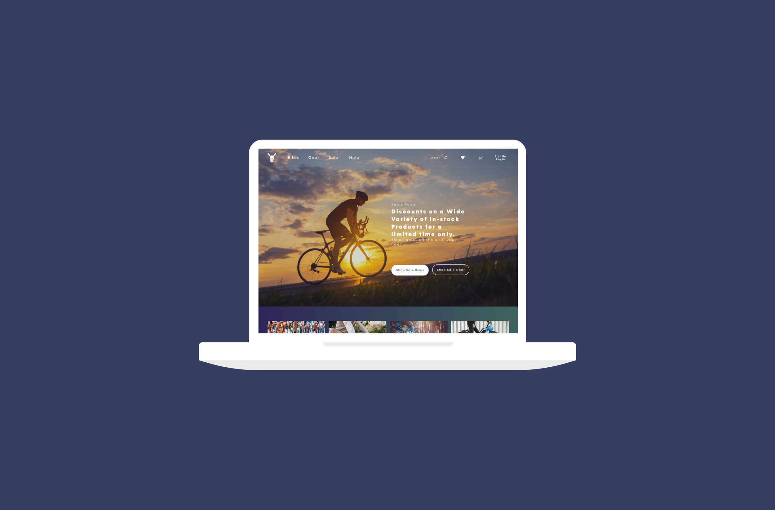
High Fidelity Prototype/Usability Testing
It’s Alive!
Using the data collected from the wireframe usability testing, a high-fidelity prototype was created. This new prototype included a fleshed-out FAQ/Help section, a more clear ‘Buy Online, Pick Up in Store’ option, and an easy-to-access Sign in/Sign up section.


User Testing Methodology
Testing sessions were conducted through Zoom
5 Participants were tested
Users were given a set of tasks to complete
Progress through the tasks was closely monitored
Following the completion of the tasks, a series of questions were asked to gauge the understanding of the purpose of the functionality
A separate set of questions were asked to gauge the overall opinion on the look and feel of the prototype
Results
Carousel Section
Some users found that the carousel added confusion to the user flow or identified that they normally wouldn’t scroll through it. This seemed to add to the overall cognitive load.
Add to Cart VS. But Online and Pick Up in Store
Some users identified as being confused with the copy on product pages. The buttons read “Add to Cart” and “Buy Online, Pick Up in Store”. This confused some users in that they weren’t sure if they clicked the pick-up in-store option, it would add the item to the cart.
Tax + Shipping
In this prototype, a subtotal was added to the cart. However, it wasn’t made clear that it included tax. Some users seemed unsure if they would put their information in a service if they weren’t 100% sure of the total.
Refine
Cleaning it all Up
Taking in the results of the previous round of usability testing, a new version of Drahtesel was created. This version included no carousel section, more clear “Add to Cart” vs. “Buy Online, Pick up in-store” buttons, and better displayed subtotal sections.
Further Solutions
What Next?
As stated before, this project is very limited in being able to accurately measure conversion rates. Due to not having existing user data or analytics, we cannot measure where on the website users would typically have higher bounce rates, better conversions, or how users are influenced by the overall user flow. It would be highly recommended that Drahtesel invest in a web analytics service. With this, Drahtesel would be able to measure user website sessions, view heatmaps, and have users fill out satisfaction surveys. These can all aid further in increasing their conversions and lowering cart abandonment. Additionally, once they have data, they can further employ tactics like A/B testing, use of specific copy, and seeing how they can establish more trust with the user.
Outcomes and Lessons
Working on Drahtesel helped me develop my skills with conversion rates and cart abandonment, user research, research analysis, UI design, usability testing, and the reduction of cognitive load.
The main lesson I took away from this project was to always keep human-centered design in mind when working through UX solutions. While working through this project, I had a lot of fun creating an interesting UI. However, I started to neglect how the user would interact with the website. I often found myself having to adjust part way through a design to make the user interactions more intuitive and easier with human interaction in mind.